
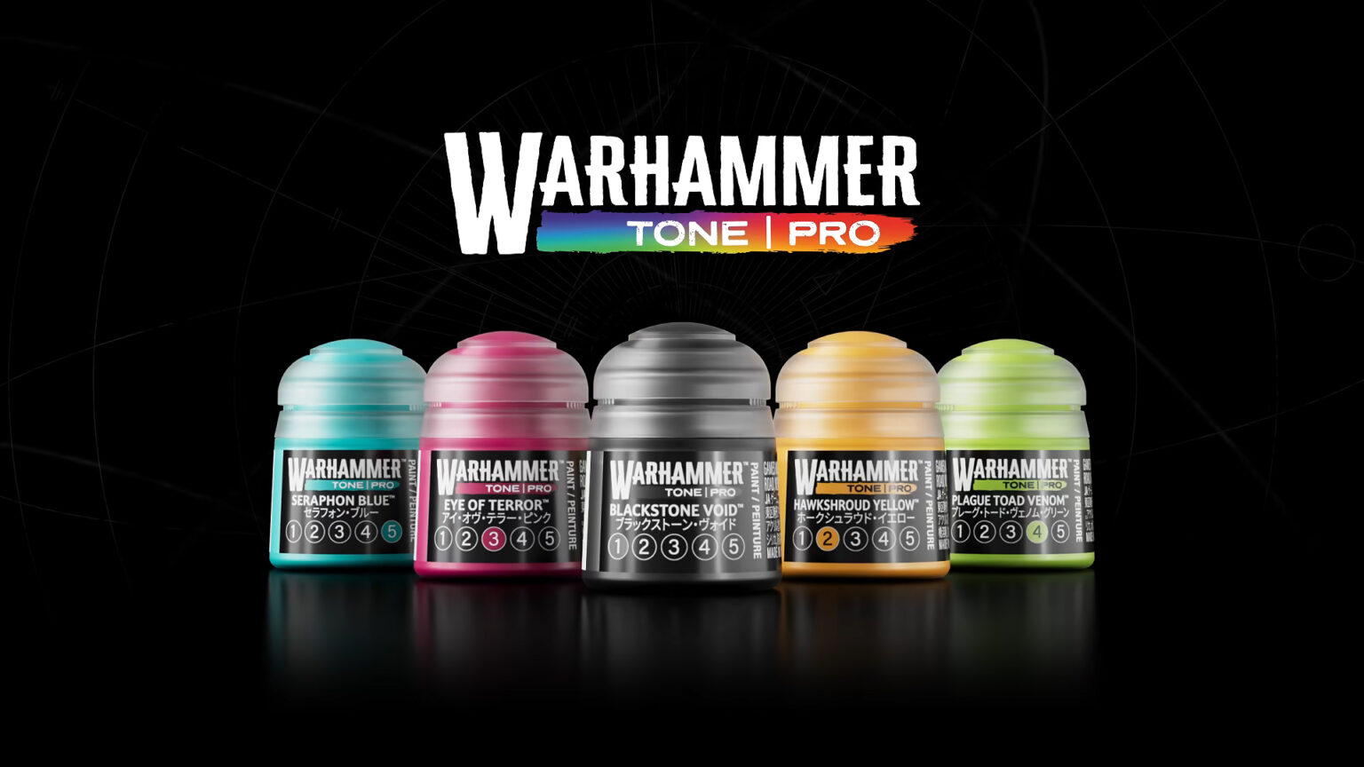
Games Workshop has announced Warhammer Tone Pro, a new paint range made up of 30 colours in 5 tones each, adding up to a total of 150 pots. It goes on sale Saturday, September 26.
The first thing that stands out is the colour palette. Tone Pro leans into more saturated tones than the Layer range, which has always kept those characteristically desaturated Citadel colours — some of them, like Thunderhawk Blue or Daemonette Hide, hard to replace with other brands.
On top of that, the range seems to fill in some blind spots that Citadel’s palette had. In my opinion, there’s always been a gap for a truly intense magenta pink. The closest thing we had until now was the Doomfire Magenta contrast paint, but now it looks like we have something more direct: Eye of Terror 3.
Warhammer Tone Pro looks set to save you painting time
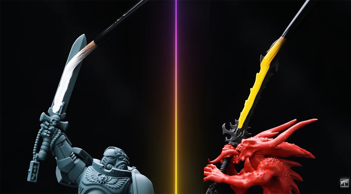
The range promises excellent coverage in a single pass, and the presentation video backs it up with some surprising examples: traditionally tricky colours like white or yellow covering solidly over black primer. Genuinely impressive, if it holds up on the table.
A color matching system simpler than others
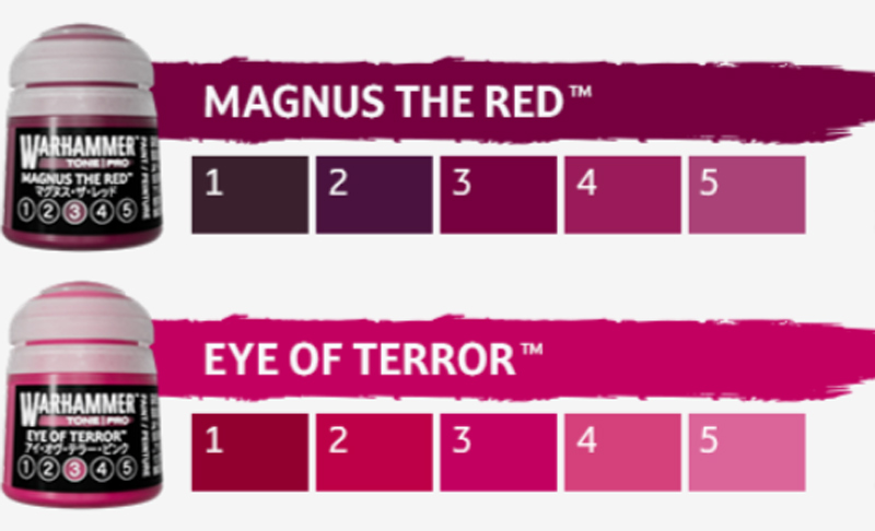
The Tone Pro system is straightforward: each of the 30 colours comes organised into 5 numbered tones, from 1 (the darkest) to 5 (the lightest). The idea is that you no longer need to hunt for a “compatible” colour to shade or highlight; you use the same colour in a different tone and your transition is already sorted.
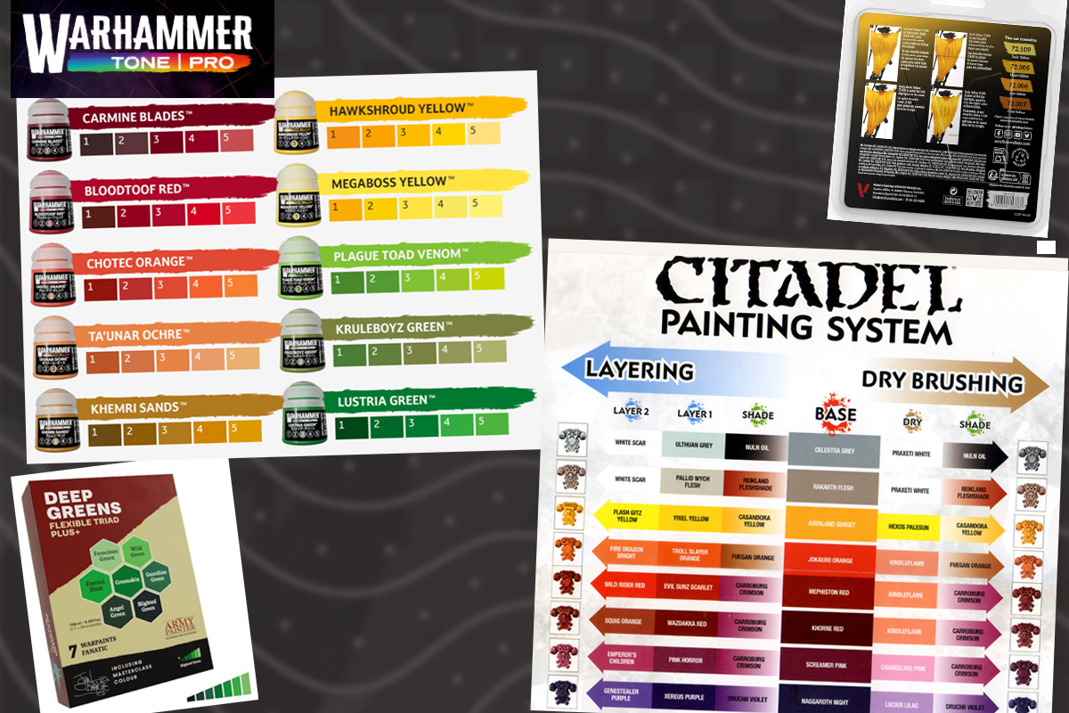
This is very reminiscent of two systems the community already knows well: Army Painter’s flexible triads (sets of 5-6 tones per colour) and Vallejo’s BSL system (Base, Shadow, Light).
Where Tone Pro seems to improve on the formula is in its naming. With Army Painter’s triads or Vallejo’s BSL, you often need to check a reference sheet to know which tone pairs with which. With Tone Pro, since the 5 tones are numbered within the same colour name, finding the compatible tone for shading or highlighting is as simple as checking the number on the pot. No need to memorise combinations or reach for an external chart.
Warhammer Tone Pro isn’t here to replace Layer paints
Citadel’s Layer paints have always been slightly translucent. The upside of this is that it makes it easy to control transitions between colours. The downside is that it forces the painter to apply several coats to get a solid, even colour. Remember that with light colours like Fulgrim Pink, it can take 5 or 6 coats to achieve a clean, opaque pink.
At the opposite end, we have opaque paints like Citadel’s Base & Layer range or Vallejo Model Color, which offer great coverage right from the start. The problem here is the reverse: to get smooth colour transitions with such an opaque paint, you need to mix colours between one coat and the next, or spend hours doing glazes to achieve a clean gradient.
The Tone Pro range seems to bring the best of both worlds: smooth transitions with the minimum number of coats possible. How does it manage this? With the 5-tone-per-colour system we’ve already explained — since the midtone, highlight, and shadow within the same colour family are already sorted for you, you don’t need to mix, nor apply coat after coat of a translucent paint to reach a solid result.
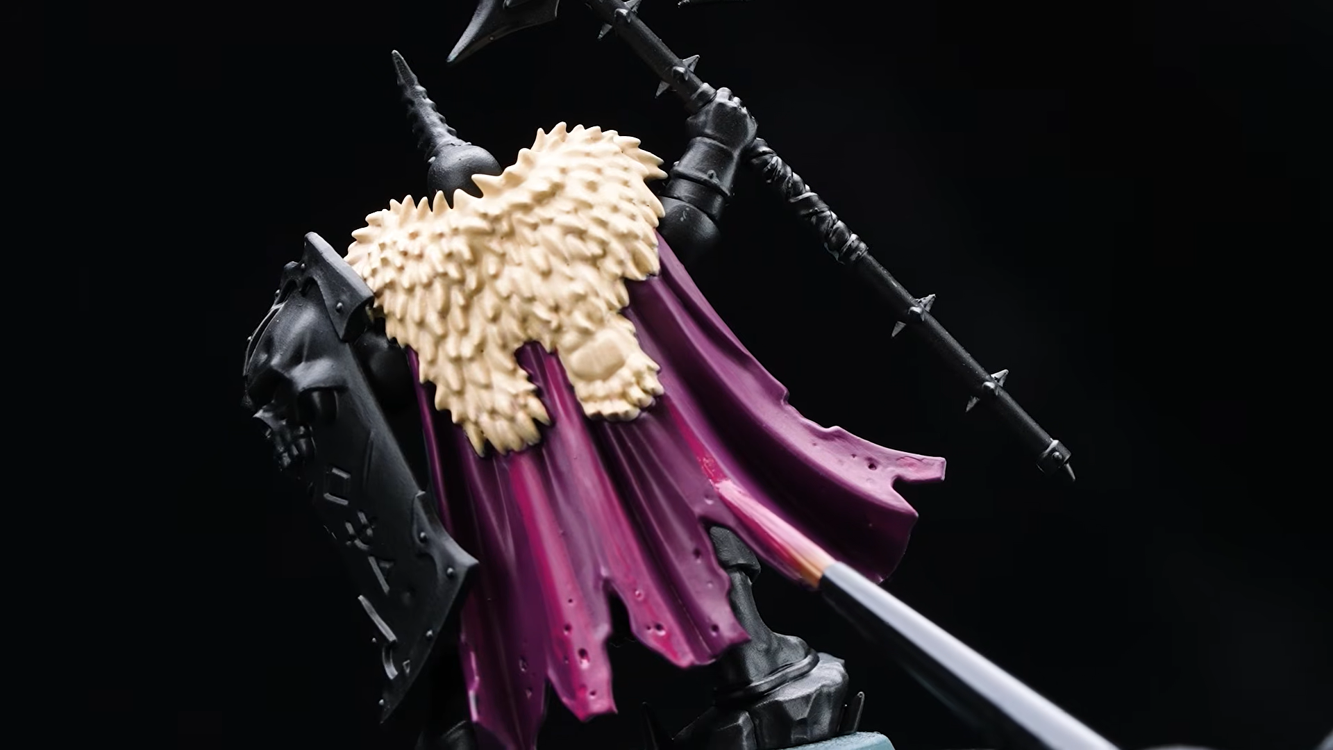
The downside: money. You’ll need to buy the pots in sets of 5 — a full pack of 5 for each colour.
Blending medium will make multicolour gradients easier
The Blending Medium acts as a retarder medium: an additive that slows down the paint’s drying time to give you more room to blend colours directly on the miniature (wet blending technique).
Until now, it’s been relatively easy to wet blend with Contrast paints, thanks to their more fluid, slower-drying formula. But with traditional Layer paints, this technique was much trickier, because Citadel had never offered its own retarder medium the way other brands do.
With the arrival of Tone Pro and its Blending Medium, we’ll finally be able to wet blend while also getting more opaque and vibrant colours than those achieved with Contrast — which, being translucent, depend on the colour of the primer for the final result.
This opens the door to more ambitious gradients in the areas of a miniature where this kind of effect is traditionally sought: flames, smoke, gems, sword blades with a metallic effect, cloaks and robes with colour transitions, or skin with subtle shifts. If the Blending Medium delivers on its promise, we should start seeing multicolour gradient tutorials become far more accessible for the average hobbyist.
@heresyforheretics Wet blending isn’t so bad #warhammer #warhammer40k #40kin40seconds #40kin40sec #warhammercommunity #warhammerworld #gamesworkshop #astartes #imperium #spacemarines #ultramarines #bloodangels #darkangels #salamanders #40k #40klore #RPG #warhammerpainting #miniaturepainting #spacewolves #spacewolf #imperialfists #speedpaint #contrastpaint #airbrush #tau #aeldari #necron #synthwave #hobby #game #tabletopgame #ageofsigmar #aos #theoldworld #dnd #mtg #chaosspacemarines #orks #warhammerlore #thearmypainter #Fanatic #paint #painting #heresyforheretics #horusheresy #worldeaters #primarch #angron #mortarion #squidmar #angrymarines #nightlords #lightning #painting #capsule #vendingmachine #salamanders #custodes #adeptus #nmm #whfb #tyranids #sistersofbattle #rainbowwarriors #rgb #spacemarineschapter #jurassicpark #jurassicworld #nova #heavys #headphones #metal #nighthaunt #ghost #noisemarine #skaven #orktober #squig #spacemarine2 #emperorschildren ♬ original sound – Heresy For Heretics
The usual controversy: the paint doesn’t come in dropper-bottle format
Here comes the big disappointment for much of the community, who have been asking for a format change for years. Traditional Citadel pots have a reputation for shortening the paint’s lifespan: they dry out easily even when sealed properly.
That said, there’s an important nuance here. With this new tone system, the need to mix colours by hand is reduced quite a bit — you no longer need to create your own midtone for a transition, since it comes already worked out in the pot itself. And if you’re mixing less, the container format matters a bit less in your day-to-day use. That’s why, although sticking with pots is undoubtedly a flaw, it’s not a catastrophic one: the range compensates for some of that inconvenience by reducing the need for mixing that used to make the format problem so obvious.
Tone Pro vs Layer vs Contrast — whats the difference?
Tone Pro allows for smooth color transitions with fewer coats than Layer o Contrast ranges, thanks to its opaque one-coat paint and its finely-graded color-matching range.
| Feature | Base & Layer | Contrast | Tone Pro |
|---|---|---|---|
| Opacity | Mid. Semi-translucent. | Low. Translucent. | High. Fully opaque. |
| Coats required per color layer | 1-6 coats (light colors usually need more coats) | 1 coat | 1 coat (including light colors, per official claim) |
| Depends on primer colour | Mid. Undercoat color can reduce the need for coats. | High. Designed for white / wraithbone / grey undercoat. | Low. |
| Control | Precise. | Imprecise. Patchy coverage on flat surfaces, but great results on textured surfaces (scales, fur, chainmail). | Precise. |
| Time consumption | High. Requires blending multiple layers and drying time, or mixing middle colors between layers. | Low. 1 coat for a 3 color effect (base, shade, highlight) | Mid. |
| Techniques supported | Basecoating, layering, highlighting, shading, glazing, dry brushing | Speedpainting, shading, glazing | Basecoating, layering, highlighting, shading, dry bruhing |
| Available mediums | Lahmian medium for glazes | Contrast, lahmian | Blending, shading |
| Color palette | Mostly low-saturation colors (compared to other ranges like Vallejo Game Color) with some high saturated colors. | Mostly low saturation colors, with some high saturation exceptions (Striking Scorpion Green, Doomfire Magenta) | Good balance between saturated colors and greys. |
| Color matching | Low. Requires trial and error or external guide. Some colors blend better than others. Some colors have confusing names (Corax White, Thunderhawk Blue) | Good. One paint acts as base, shade and light color. Some color are “flat” in tonal depth. Some colors have confusing names (Volupus Pink, Sigvald Burgundy) | Best. 5 numbered tones per colour. Out-of-the-box matching logic. |
| Cost | Mid. For a full color (base, shade, light) you need at least 3 pots. | Low. A full color (base, shade, light) is contained in one pot, in most of the cases. | High. Each color needs 5 pots for optimal effect. |
Which range is best for me?
- Pick Layer paints if you have plenty of time to learn, you enjoy painting details and aspire to achieve box-art results.
- Pick Contrast if you like to paint big armies quick and you don’t worry about painting little details.
- Pick Tone Pro if you have money to afford it, you want better results than contrast and lack time to spend on layering.
